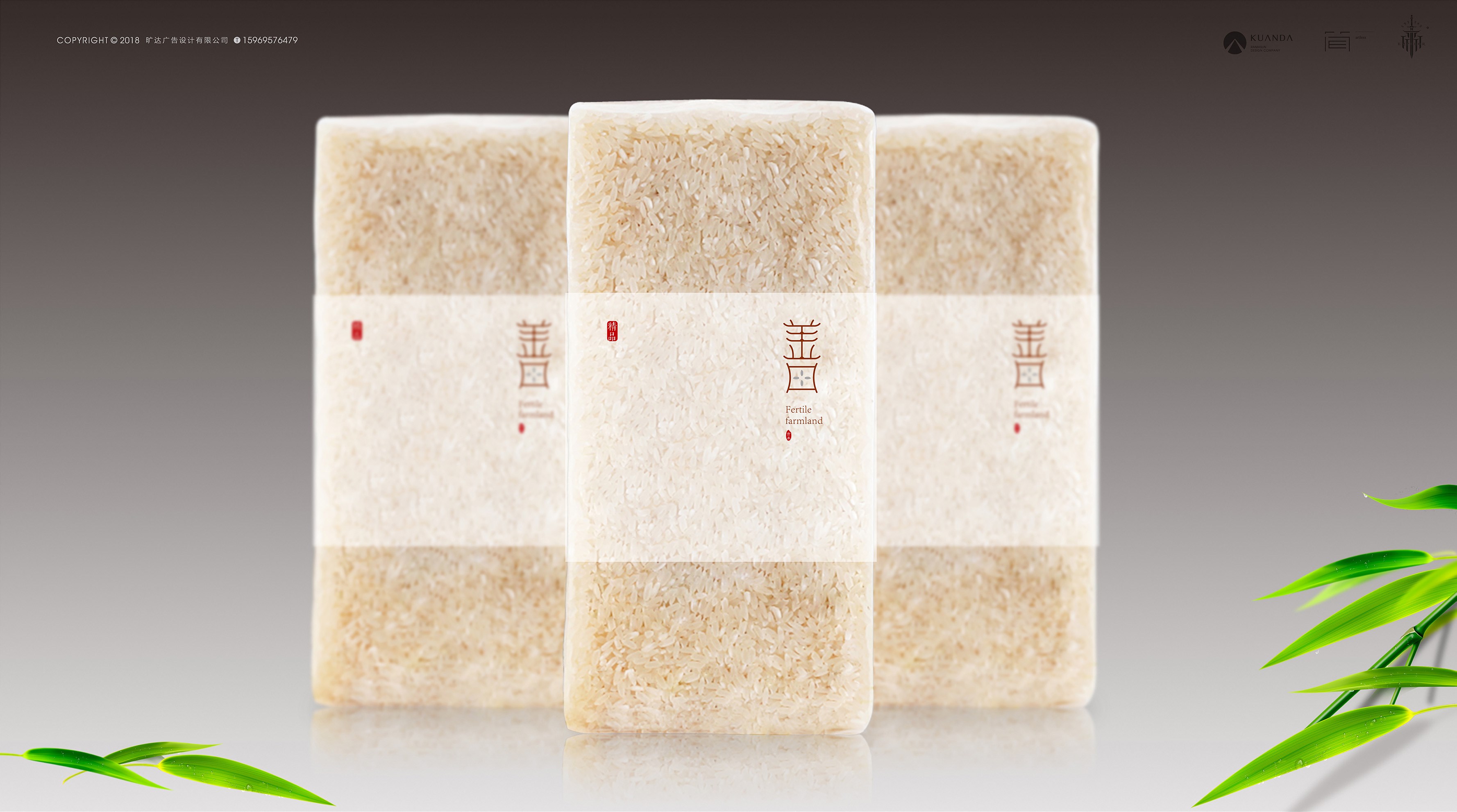
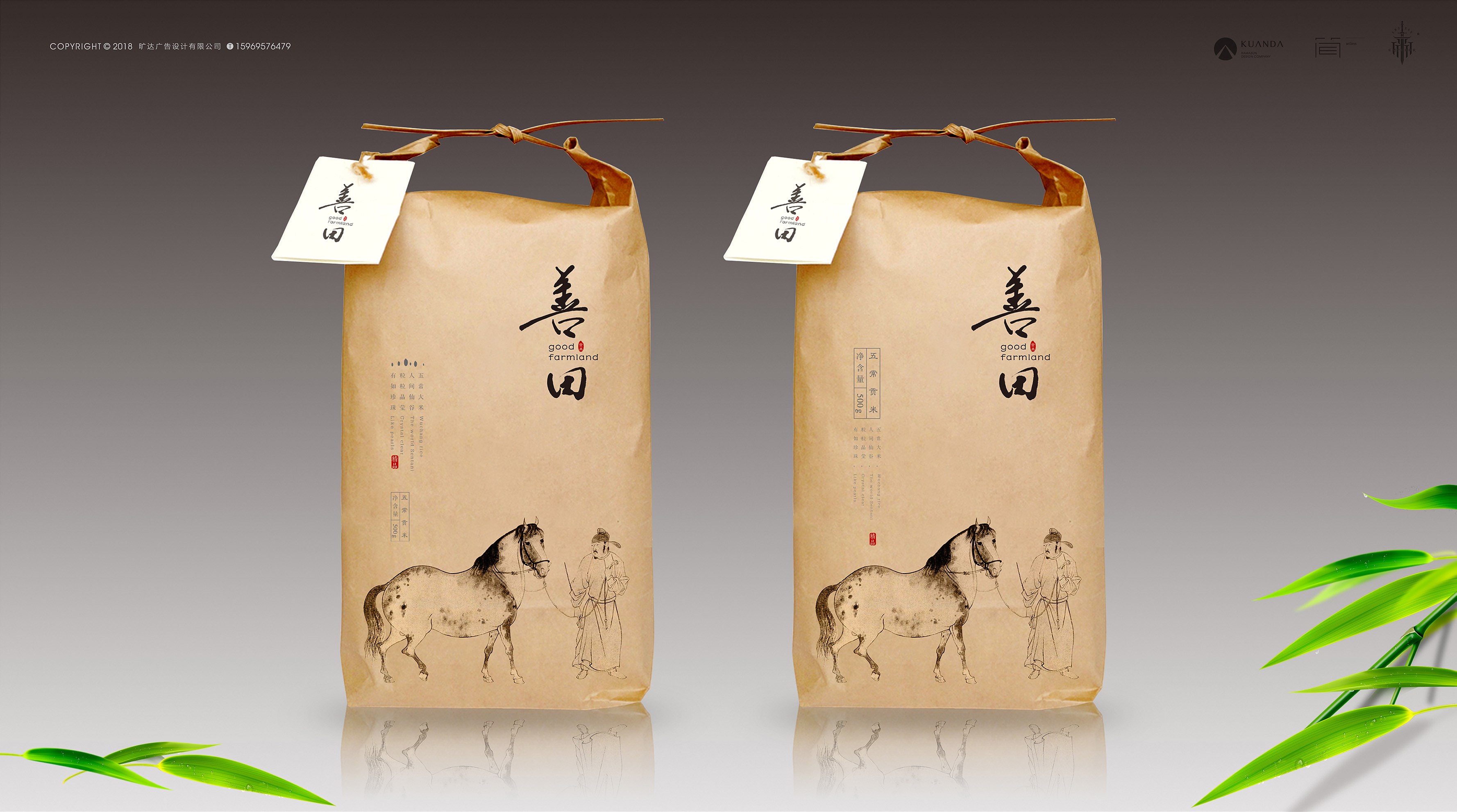
Heilongjiang wuchang rice
黑龙江五常大米善田
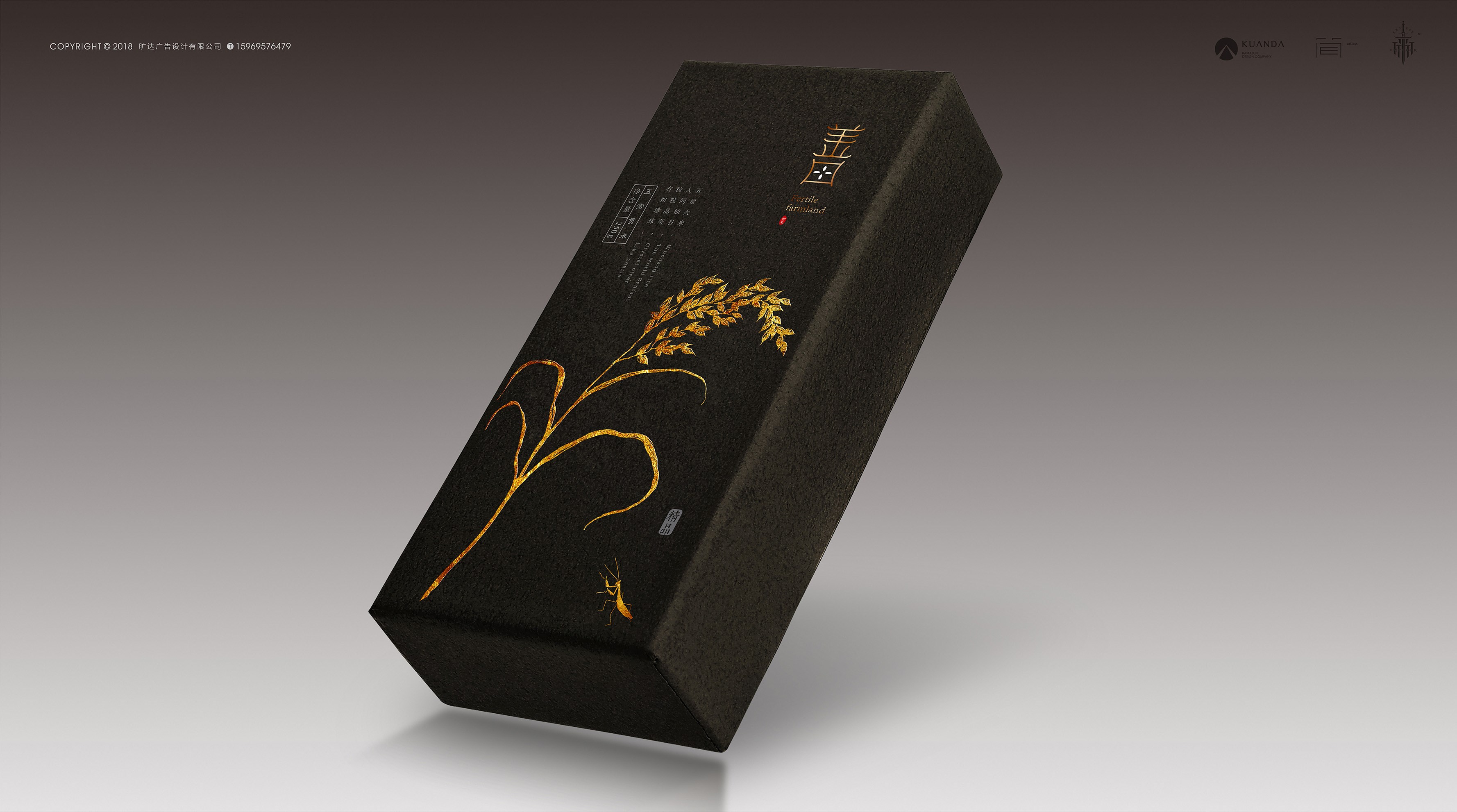
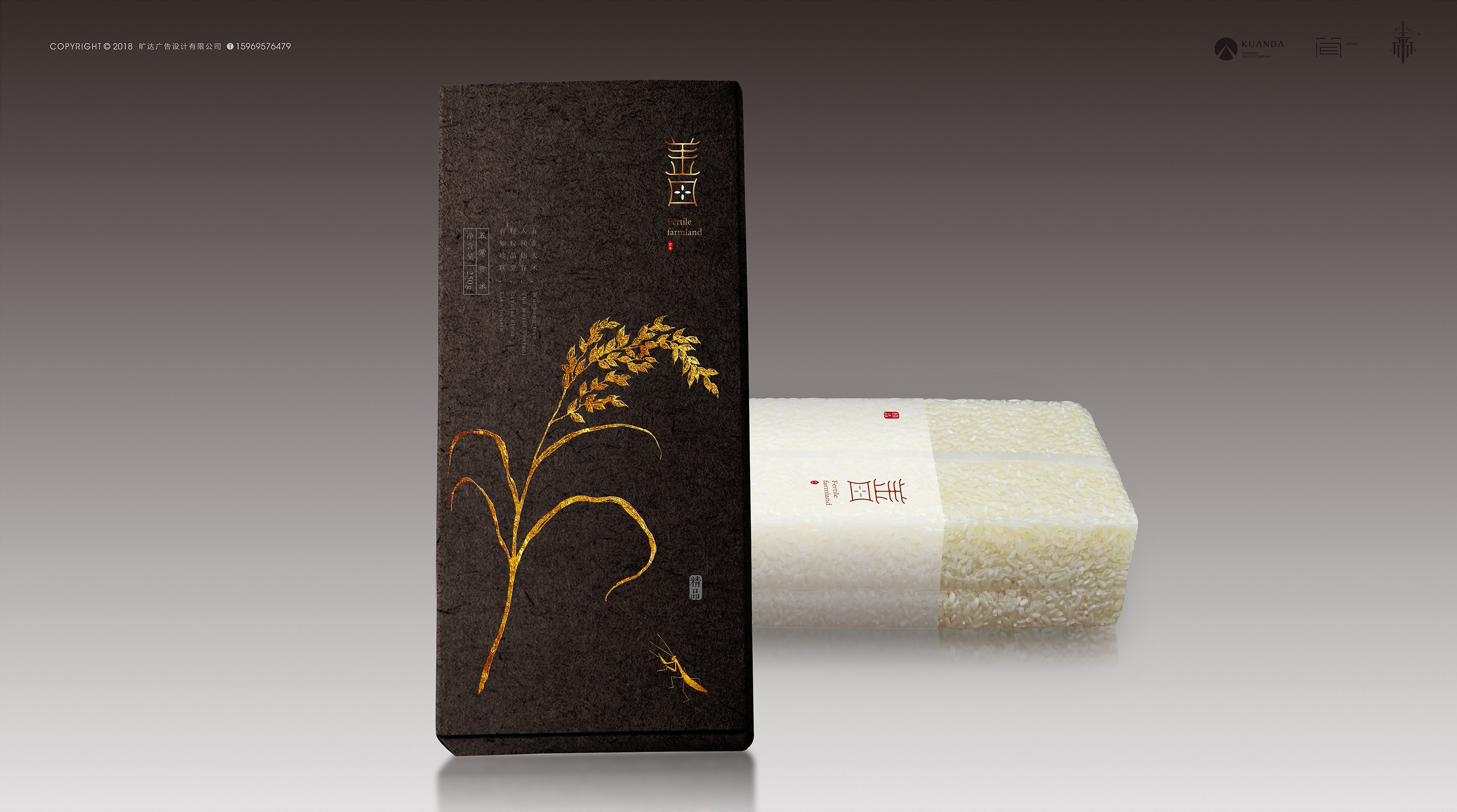
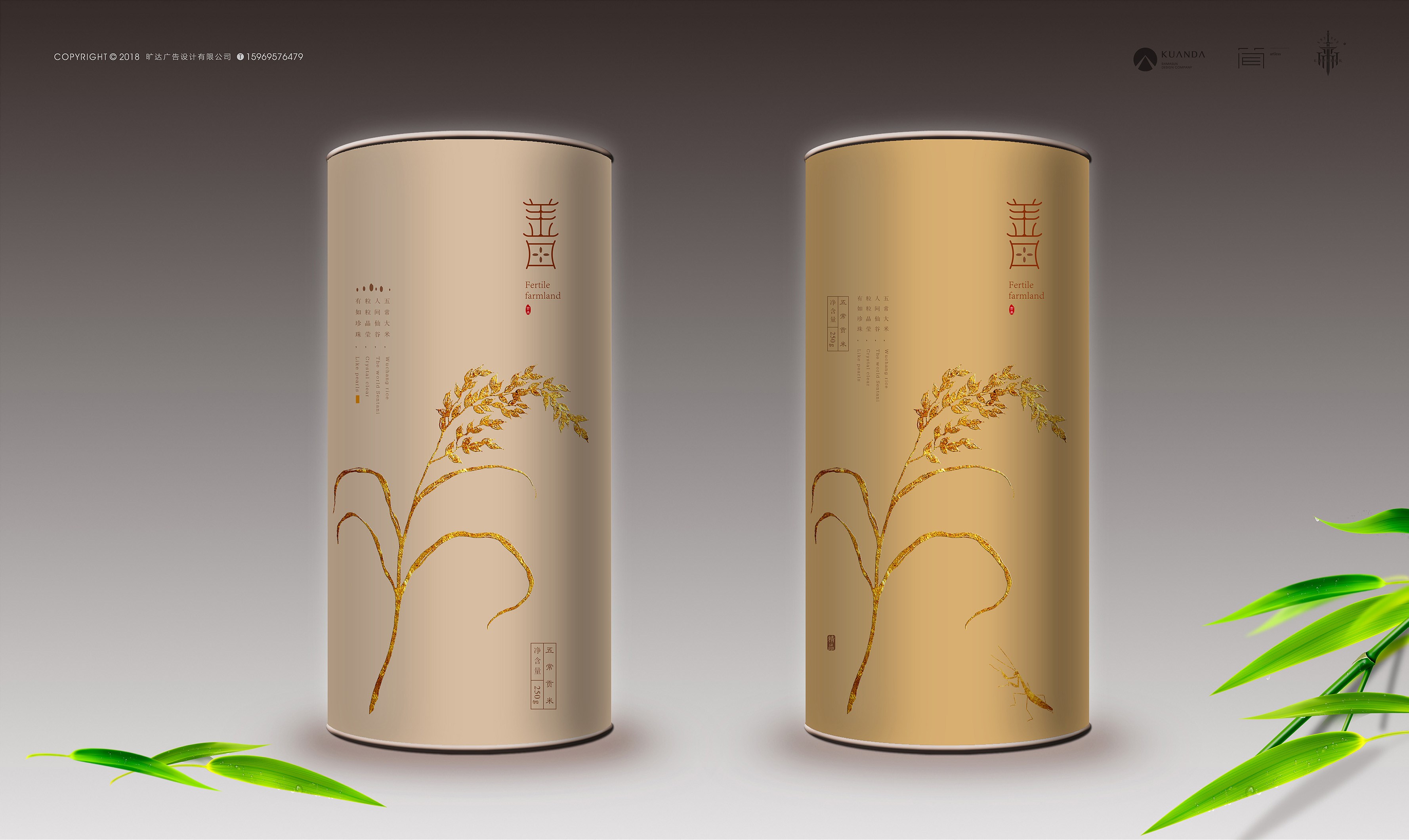
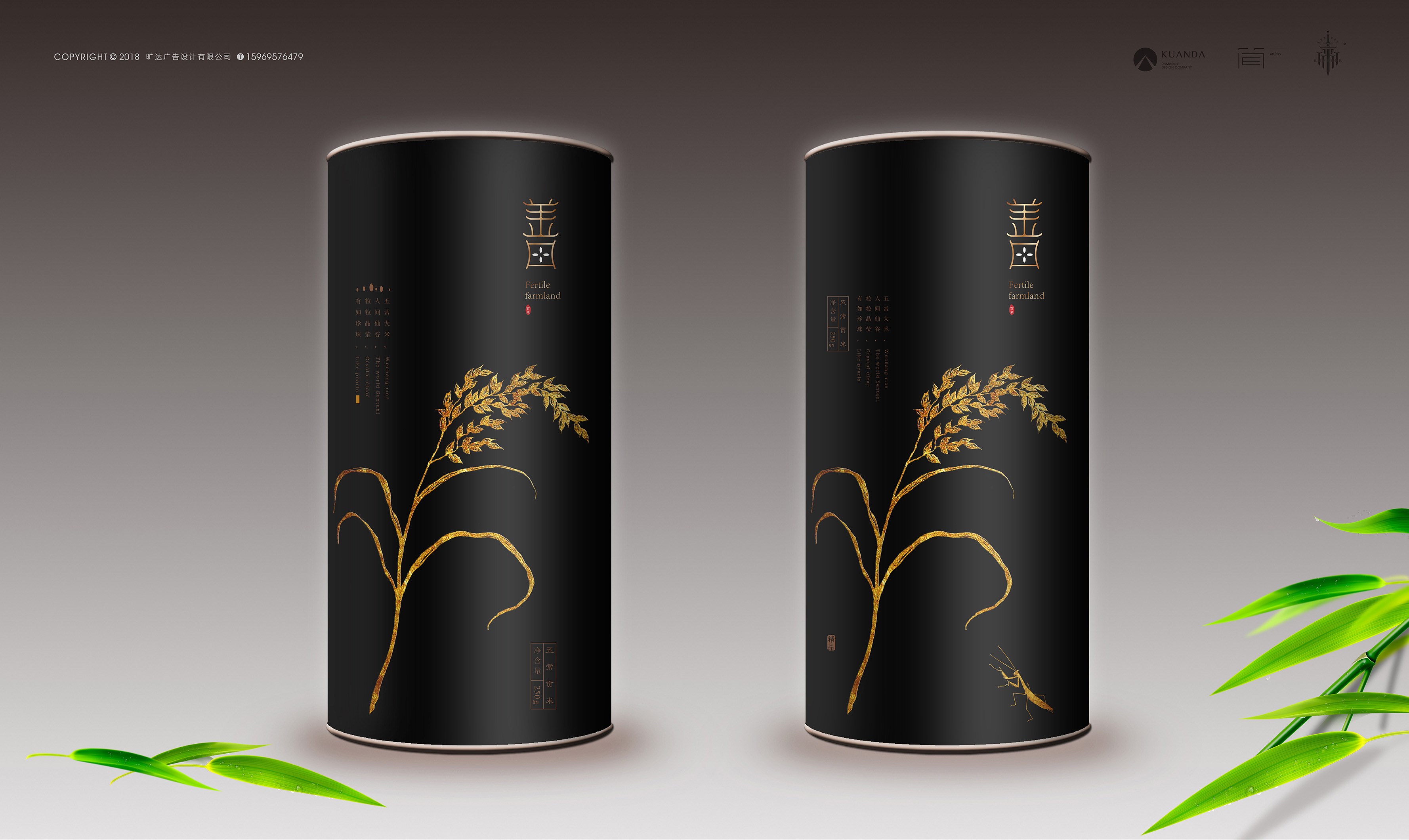
善田包装以中国风设计为主导,黑色代表黑龙江最独特的水稻土地资源,金色寓意着每粒五常稻子的成熟与实在。设计主题以一枝生动饱满的稻穗为主形象,通过右下角螳螂的点缀好似一副充满诗情画意的国画作品让消费者通过诗一般的包装画面去联想和体会五常大米的生态与纯正的品质,结合后期制作工艺通过质感的触摸再次加深品牌在消费者脑中的印象。
Shantian packaging is mainly designed in Chinese style. The black color represents the most unique land resources of rice in heilongjiang province, and the gold color symbolizes the ripeness and reality of every wuchang rice.Design theme is given priority to with a vivid and full of grain, the ornament of mantis by the lower right corner like a vice is full of poetic works of Chinese paintings let consumer packaged with poetic images to lenovo and realize the p5 rice ecology and pure quality, combining with the post-production process through the sense of touch again brand in the consumer impression in the brain.

嘉华食品
JOY BAKERY
霸王茶姬
BA WANG CHA JI
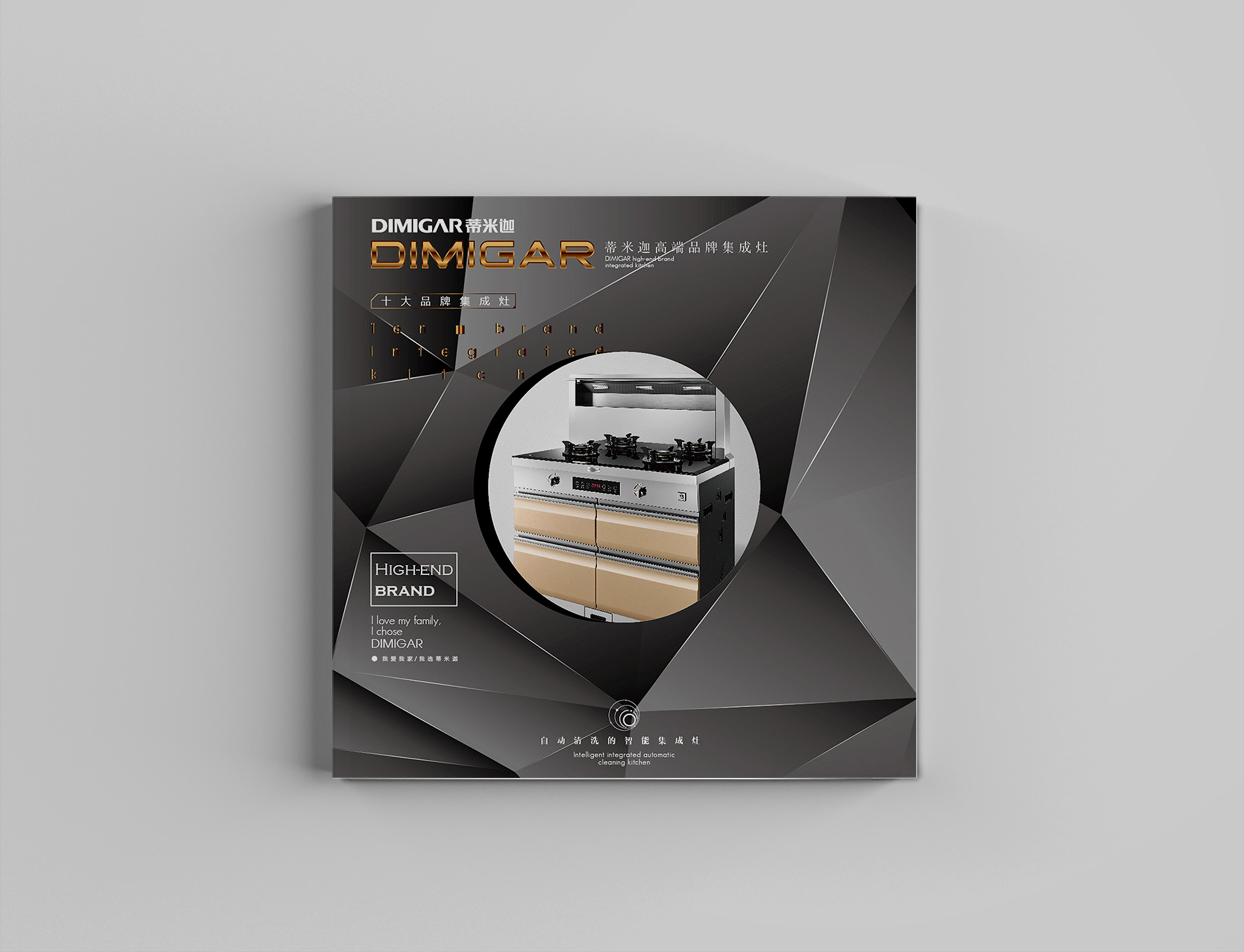
Kitchen stove brand design
企业品牌设计-厨灶品牌设计
Chuangyi club brand image design
创亿俱乐部品牌形象设计
Black zongzi of Mojiang river
墨江黑粽(实物展示)
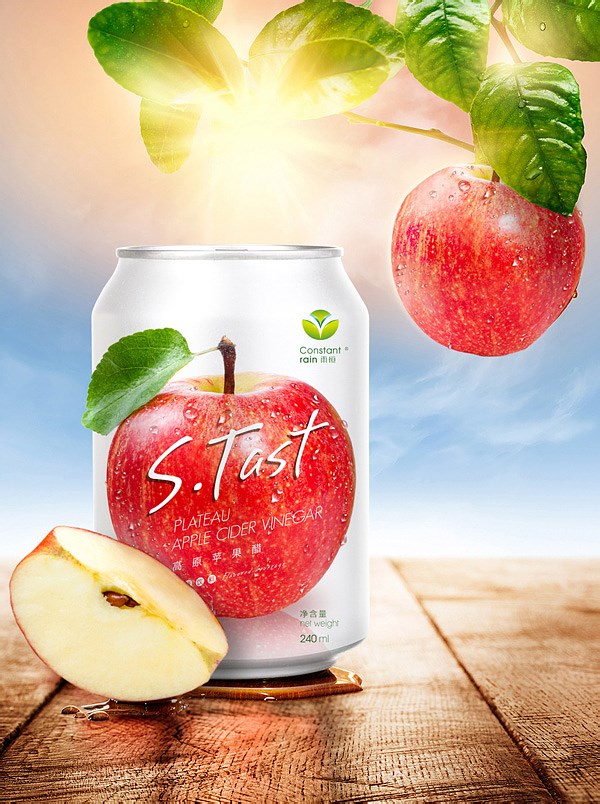
Highland Apple Cider Vinegar
高原苹果醋(品牌)
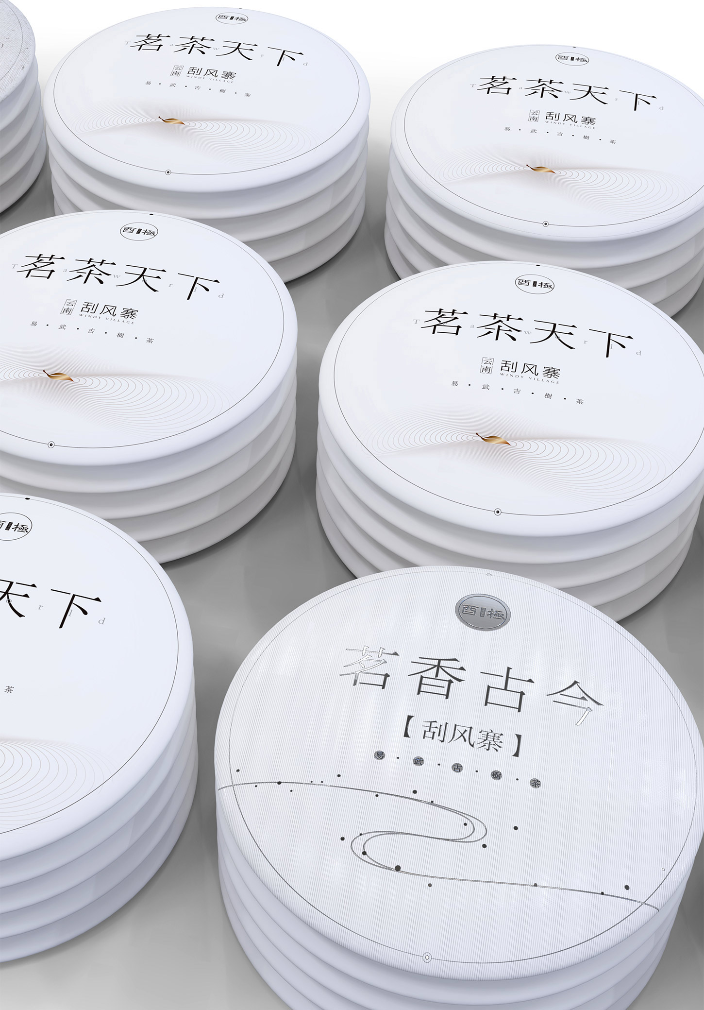
Bungee tea
台湾-酉极茶品牌
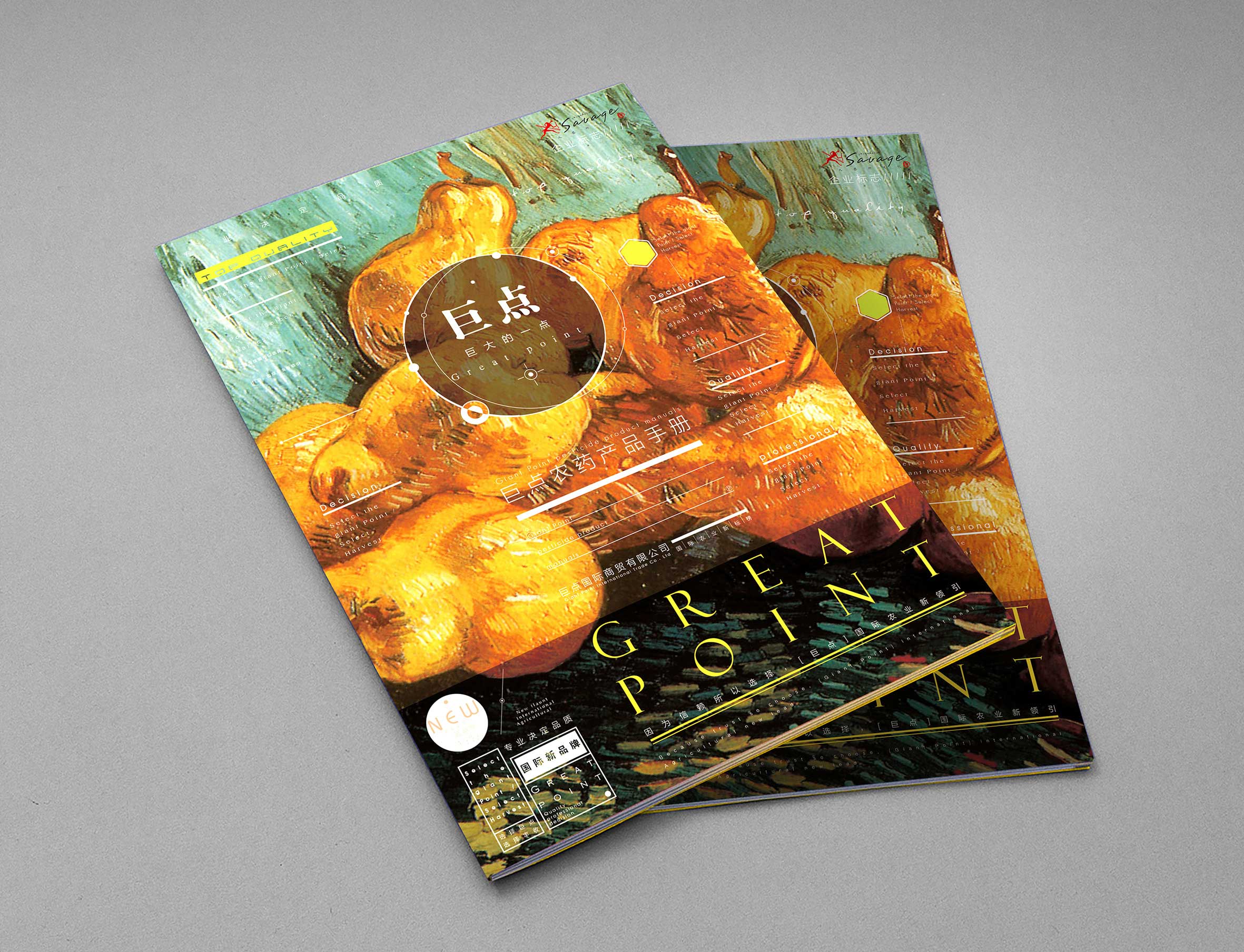
Huge points of agricultural trade
巨点农资品牌设计
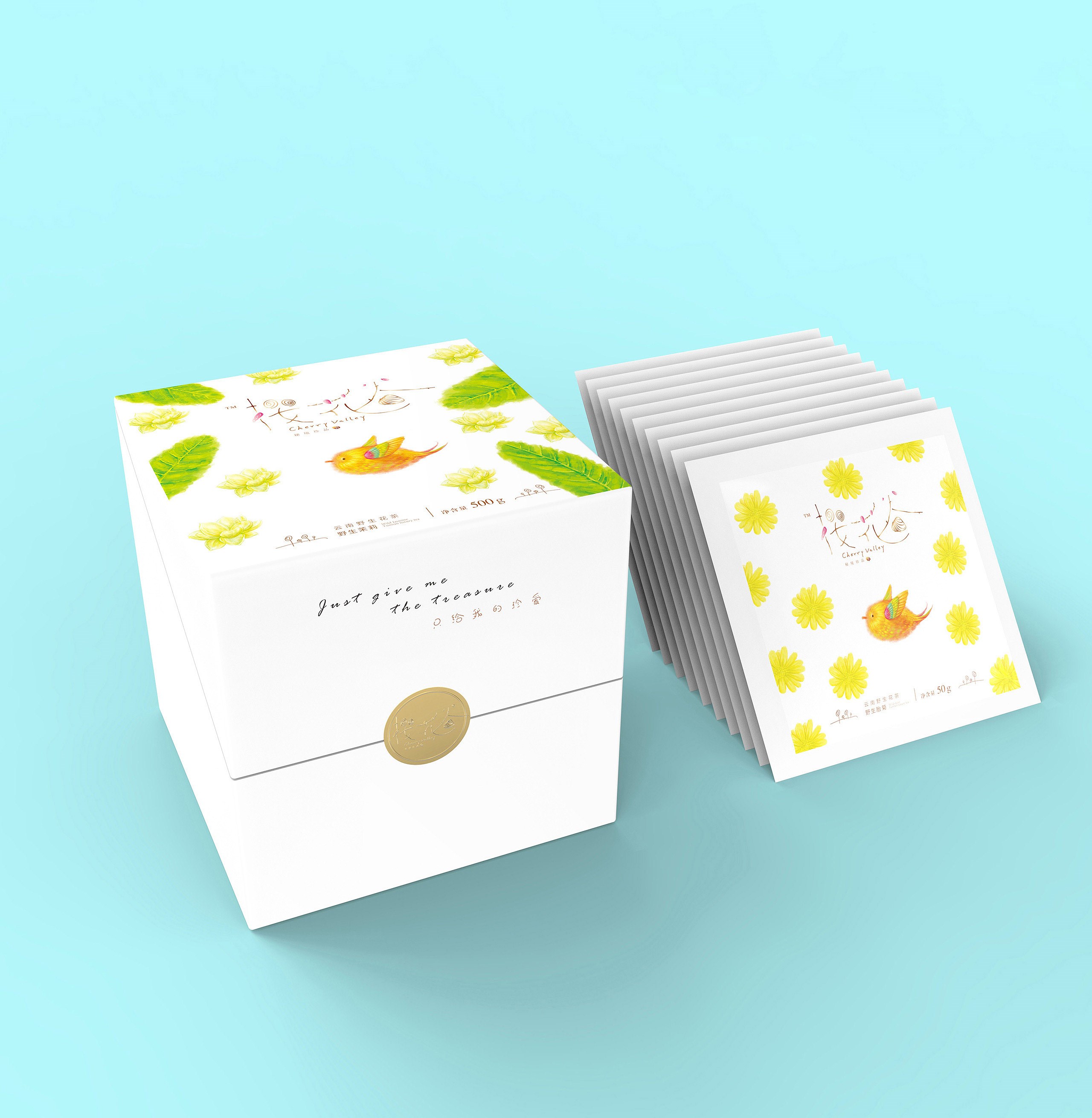
Cherry valley2
樱花谷(系列2)
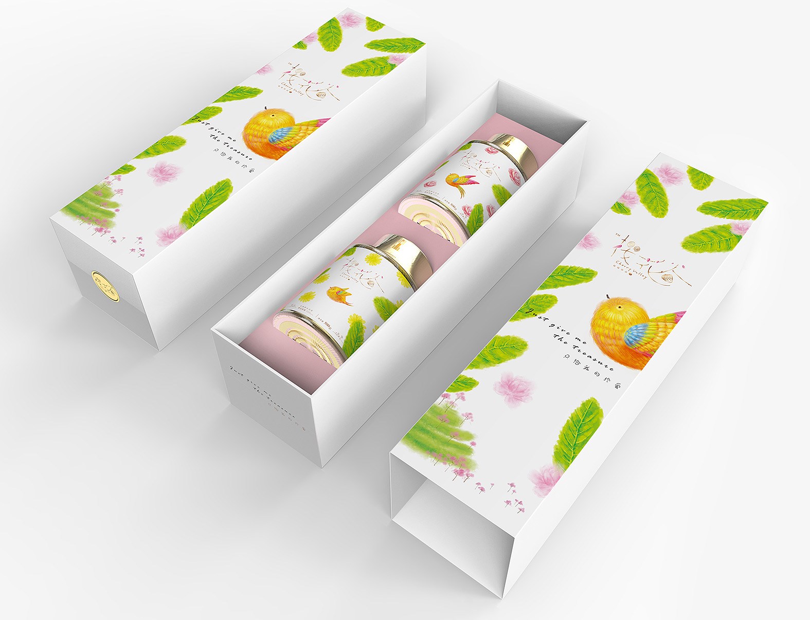
Cherry valley
樱花谷-花茶包装

Heilongjiang wuchang rice
黑龙江五常大米善田
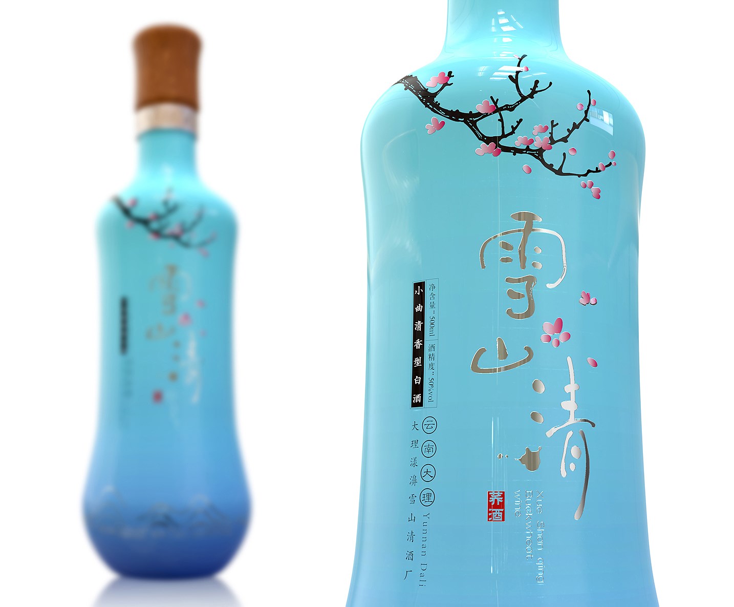
Dali packaging design case display: Dali snow mountain qing liquor series (ii)
大理包装设计案例展示:大理雪山清清酒系列(二)
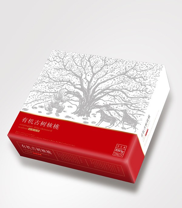
Dali Raus old tree walnut
拉乌古树核桃

Kunming Huadu Oceanarium
昆明花都海洋馆

FLYING CRANE MILK POWDER
飞鹤奶粉
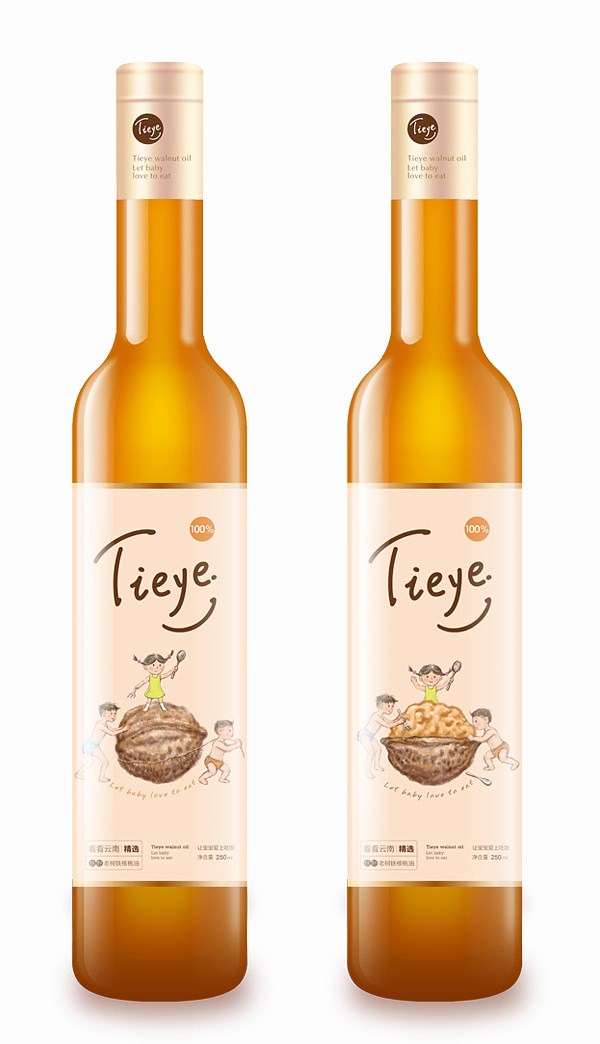
WALNUT OIL
紫江定制核桃油

Chu Orange Premium Drinks
褚橙高端饮品

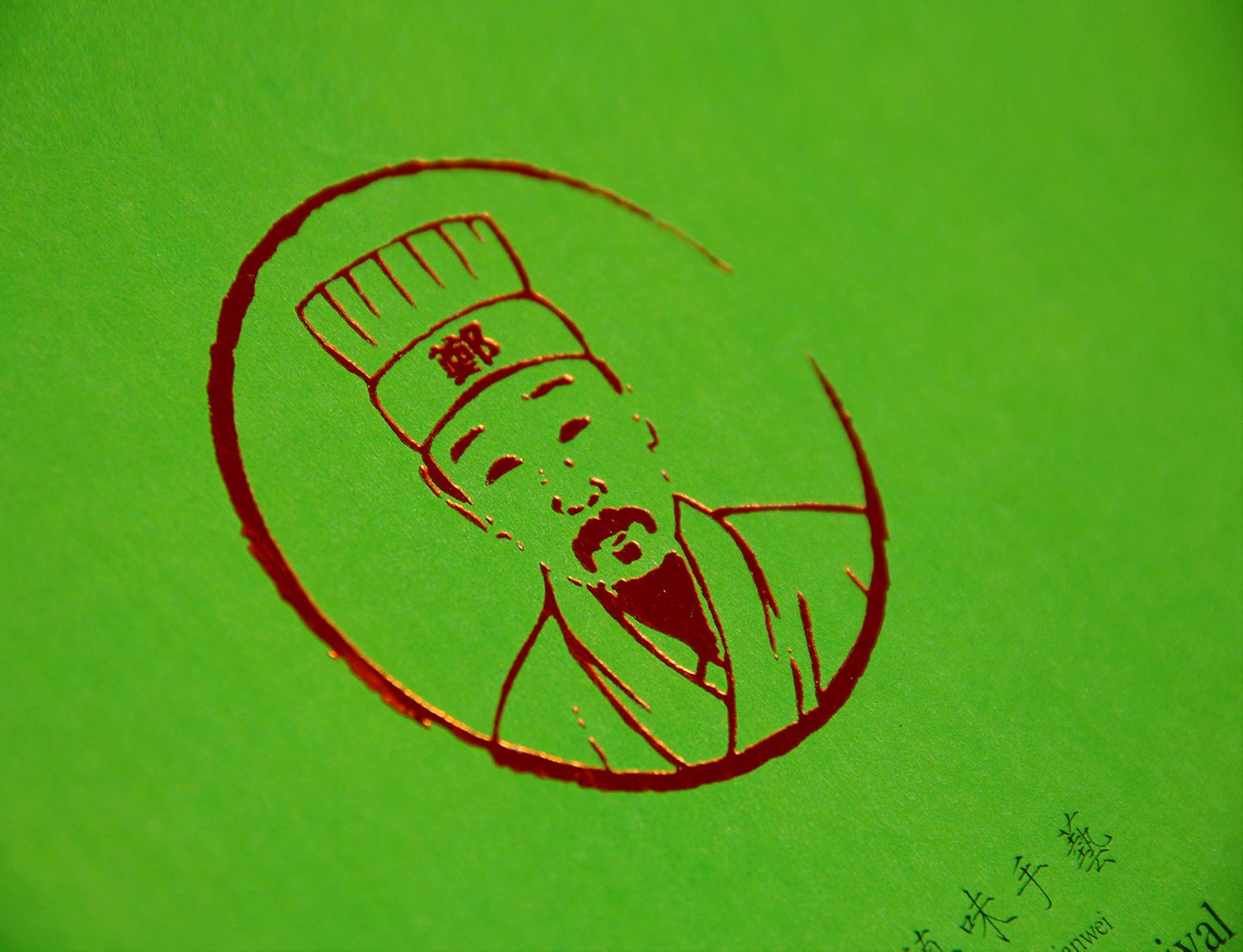
CHUAN YI CLUB
创亿俱乐部

Songhe Wine Group
宋河酒业集团
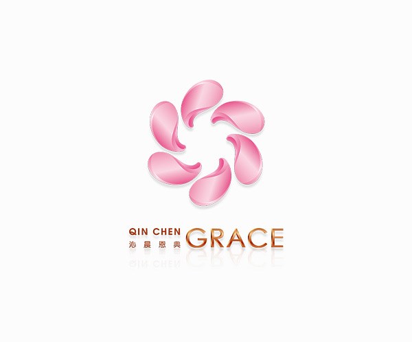
QIN CHEN GRACE
沁晨品牌设计
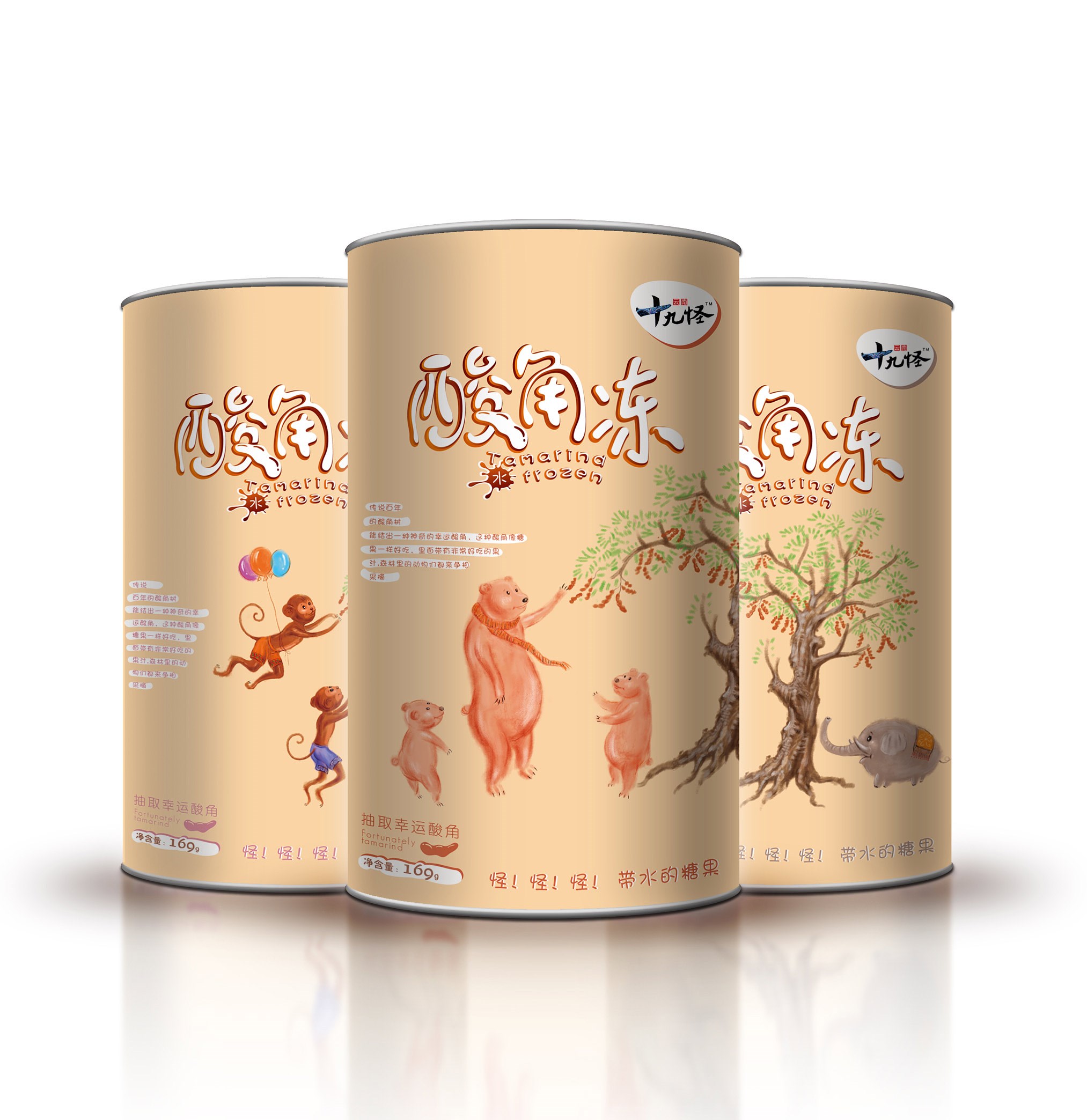
Yunnan ninety nine
云南十九怪酸角冻
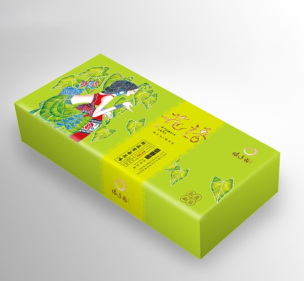
Lian Chen Flowers Cake
连宸鲜花饼(三)
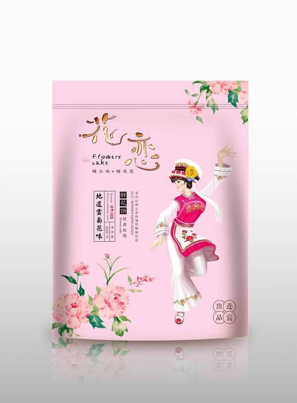
Lian Chen Flowers Cake
连宸鲜花饼(一)
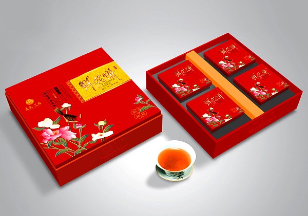
Lian Chen Flowers Cake
连宸鲜花饼(二)
扫描二维码分享到微信